


BANANA REPUBLIC HOME
OVERVIEW
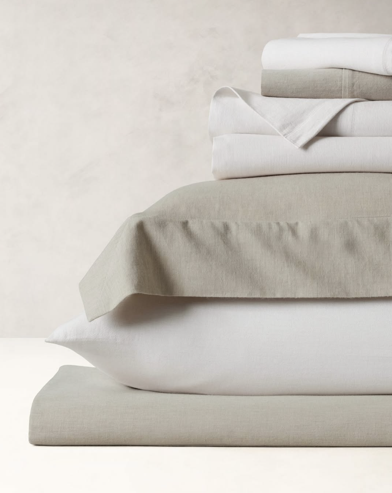
MY ROLE
As a Senior UX Designer on the Fairwinds team, my first project was to design the BR Home website from scratch for Banana Republic’s new home furnishing decor launch. Rather than build this new website on their legacy platform, they wanted a new Shopify website that would link back to their apparel website.
Our goal was to create a modern, bold, and luxurious website and brand identity that would highlight the beautiful textures and details of the BR furnishings. One of our biggest challenges was designing before the product had even been finalized and photographed.
Owned the design for BR Home Rolling updates, Wire-framing, Prototyping, Research, UX/UI design, Component Library, UAT
TIMELINE
1 year + Rolling + UAT
GOAL
Create a seamless, elegant end-to-end experience that showcases Banana Republic Home as a luxury brand, blending elevated design, storytelling, and enterprise merchandising into an intuitive, desirable journey.
APPROACH/RESEARCH
I analyzed the customer journey, user needs, and competitive landscape to identify key opportunities for improving engagement, discovery, and conversion -
Make customization simple and visual, while celebrating the details.
Inspire users with styled rooms and visual storytelling, while making it easy to take an action, plan, save, share, or buy.
Enable intuitive filtering by availability, size, style, price, and collection.
Support creative exploration with moodboards, space planning, and visual navigation.
Help them visualise the piece in their space or within a sample space.
Ensure fast checkout and transparent post-purchase tracking.

HOMEPAGE
PDP FOR BUNDLES
KEY PROJECTS

AR SPACE PLANNER

PLP GRID
COMPONENT LIBRARY

SEARCH ENHANCEMENT
GOAL
DESIGN
HOMEPAGE
LAUNCH & TESTING
Create a homepage that reflects BR Home’s luxury positioning through immersive imagery, communicates the brand’s breadth of offerings, and supports product discovery and merchandising.
CEO Sandra and BR leadership envisioned a homepage that feels elevated and editorial, showcasing beautiful product and room imagery, while highlighting key brand pillars such as craftsmanship, category depth, and new experiences like BR Home Atelier and Atlas.
I conducted a competitive audit of luxury home brands and analyzed successful homepage strategies. This helped shape the visual and structural hierarchy, balancing inspiration, navigation, and commerce.
I presented multiple design directions aligned with business goals. The selected approach included:
A large hero image showcasing products in a styled room
Visual category grid for intuitive exploration (a standout feature with high engagement)
Shoppable rooms to help users understand product scale and how pieces work together
Editorial storytelling to communicate artisanship and craftsmanship
Merchandising modules, store updates, and BR Home Atelier highlights
These modular sections were designed to be flexible and swappable based on marketing needs.
I Partnered closely with BR leadership, product owners, and engineering from concept to launch. Three responsive breakpoints (desktop, tablet, mobile) were designed, with clear handoff documentation and optional modules for adaptability.
I led multiple rounds of UAT to validate functionality and ensure a smooth user experience across breakpoints. Post-launch analytics showed high interaction with the visual category grid and shoppable rooms, validating both design and business intent.
PDP FOR BUNDLES
RESEARCH
EXPLORATION
LAUNCH & TESTING
Studied brands like Brooklinen, Apple, and Boll & Branch. Brooklinen uses both a simple bundle selector and a step-by-step builder. Apple and Boll & Branch follow step-by-step configurations with review steps. These patterns helped shape our options and validate user expectations.
Options Explored - Step-by-step builder with review, “Start building” button that opens a configurator panel, Moodboard-style configurator, On-page expanding configurator (final choice)
The fourth option was selected after close collaboration with developers and the creative team—it was the most efficient to build while still being user-friendly and aligned with the existing PDP structure.
Collaboration - Worked closely with engineering, creative, and leadership at BR to evaluate all options and ensure a feasible, effective, and scalable solution.
Launch & Testing - Shared a complete flow with edge cases and responsive behavior mocked up. Conducted multiple rounds of UAT, resolving all issues prior to launch. No usability concerns were reported post-launch.


Increase sales of bedding bundles by launching a dedicated PDP with a 15% bundle discount. The design needed to offer an intuitive way to configure bundles, allowing customization of each item while clearly showcasing the exclusive discounted pricing.
This was a fast-turn project. The main challenge was to enable full bundle customization within the existing PDP template to minimize development time and maintain a consistent user experience across the site.
To support both user types—those wanting a single selection across all items and those wanting to customize each piece—the flow began with selecting shared attributes (e.g., size, color). Once selected, individual bundle items expanded, allowing users to edit each piece. Opportunities for add-ons and upsell were also built into the flow.
The feature launched successfully and, as reported by the BR team, led to a significant increase in bundle sales, validating both the design approach and implementation strategy.
BUSINESS GOAL
SOLUTION
OUTCOME
GOAL
DESIGN
PLP
USABILITY TEST
In our usability testing, we narrowed my options down to two for A/B testing. A - with all swatches exposed in a carousel, and B - showing only five swatches with a total count that expanded on interaction. Surprisingly, the more minimal option B, showing fewer swatches, drove higher engagement and PDP views, challenging our initial assumption that full visibility would be more effective.
A
HANDOFF & LAUNCH
Goal - Drive product discovery and conversions by effectively presenting products, important details, and categories
Design - The PLP design adapts to the user's path by displaying clear, anchored product categories that expand to show all items within each. Users can toggle between Small, Medium, and Large grid views for easier browsing, with filtering, sorting. Intersperse content blocks to encourage exploration of specific styles. A ‘Quick Look’ feature that offers a peek into the Product Page to boost engagement and enable direct purchase from PLP. I collaborated with the design lead, my director, BR creative leadership, and developers to bring this to life.
I studied multiple brands and found that offering different grid views gives users control over how they browse, whether they prefer a detailed view with larger images and info, or a compact grid for quick scanning. I specifically love how it mirrors the way customers explore products in-store, either browsing broadly or focusing in when something catches their eye.
Accessibility was considered by ensuring adequate spacing between swatch click areas and interactive elements to support ease of use across devices and for users with varying abilities.

B

For handoff, I shared redlines and detailed designs across breakpoints, covering edge cases and scenarios, including panel behavior, grid layout variations, and content block responsiveness to ensure consistent performance across devices.
The PLP launched in the first phase (Home 1.0), followed by the Quick Look feature in the second phase (Home 2.0); I conducted UAT during the launch to ensure functionality and user experience met expectations.
The launch boosted product discovery and user engagement, increased traffic to PDPs, and contributed to conversions.
DESIRED IMPACT
CHALLENGE
SCOPING
GOAL
SPACE PLANNER
DESIGN
COMPETITIVE STUDY
Create an innovative tool that empowers users to plan their space by visualizing products in their environment and seeing how items complement each other, enabling more confident and informed purchase decisions.
Drive sales, increase customer engagement, reduce return rates, and position BR Home as a forward-thinking, design-led brand.
To ensure a focused MVP, we included only the most essential tools:
Upload a photo
Name and save the space
Hide items in the photo
Add/edit/remove BR Home products
Add to cart (ATC)
Users can start by either uploading a photo of their room or choosing an empty room template. They can erase existing items in their space and add BR Home products using the interactive “Add” panel. Products can be moved, edited, or removed. Users can add items directly to the cart from the planner and revisit saved spaces at any time.
I explored multiple design options for the "Add" panel—evaluating trade-offs in discoverability, simplicity, and usability. This was a critical component for seamless product discovery and interaction within the space planner.
Competitive Research - Ikea’s extensive space planning tool served as a benchmark for refining the feature set and interaction patterns. It helped inform decisions around usability and feature prioritization.
Create an innovative tool that empowers users to plan their space by visualizing products in their environment and seeing how items complement each other, enabling more confident and informed purchase decisions.
Designing for smaller screens while maintaining product scale and visual quality was a key challenge. There were few direct competitors to reference, requiring original UX thinking. Delivering high-quality renders and defining a scoped set of features for an MVP added further complexity.
GOAL
PROBLEM
SOLUTION
IMPACT


AFTER
SEARCH ENHANCEMENT
Boost user engagement and product discovery by making search more visual and intuitive, using popular searches, smart visual product suggestions, and merchandising.
The search functionality was underutilized by users, indicating potential issues with its usability or perceived value. Further indicating missed opportunities for users to efficiently find relevant products, ultimately affecting user satisfaction and overall conversion.
Revamped the search experience by keeping the main navigation intact while using search and introducing popular searches and visual category suggestions upfront. As users begin typing, these dynamically shift to smart search prompts and visual product suggestions based on input. This enhances product discovery, reduces friction, and creates a more engaging, guided search journey.
I performed competitive research across brands like Crate and Barrel, Rove Concepts, Arhaus, and Article to understand best practices in promoting product discovery, visual guidance, and search engagement.
I handed off a file to the development team that included both mobile and desktop breakpoints with redlines covering the nav and search dropdown.
Increased user engagement with search, increased PDP traffic led by product merchandising via search, and conversions, reduced bounce rates in search.
BEFORE